Achievement
.Graphic Design EN
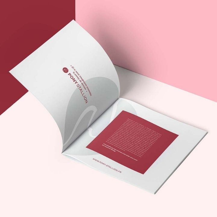
Pony Stallion
14.05.2020
This logo shows how we use negative spaces thanks to its red tint.
For our client who supports and promotes the pony industry, the graphic identity actually evolved into several communication supports.
It is easy to understand and impactful and we aim to use specific shapes in a brochure that matches the ambition of Pony Stallion.